
Appreciate
UI and UX design for an app that empowers new real estate investors with the info they need.
Timeline
3 months
My Role
Tasks
UX research, UI design
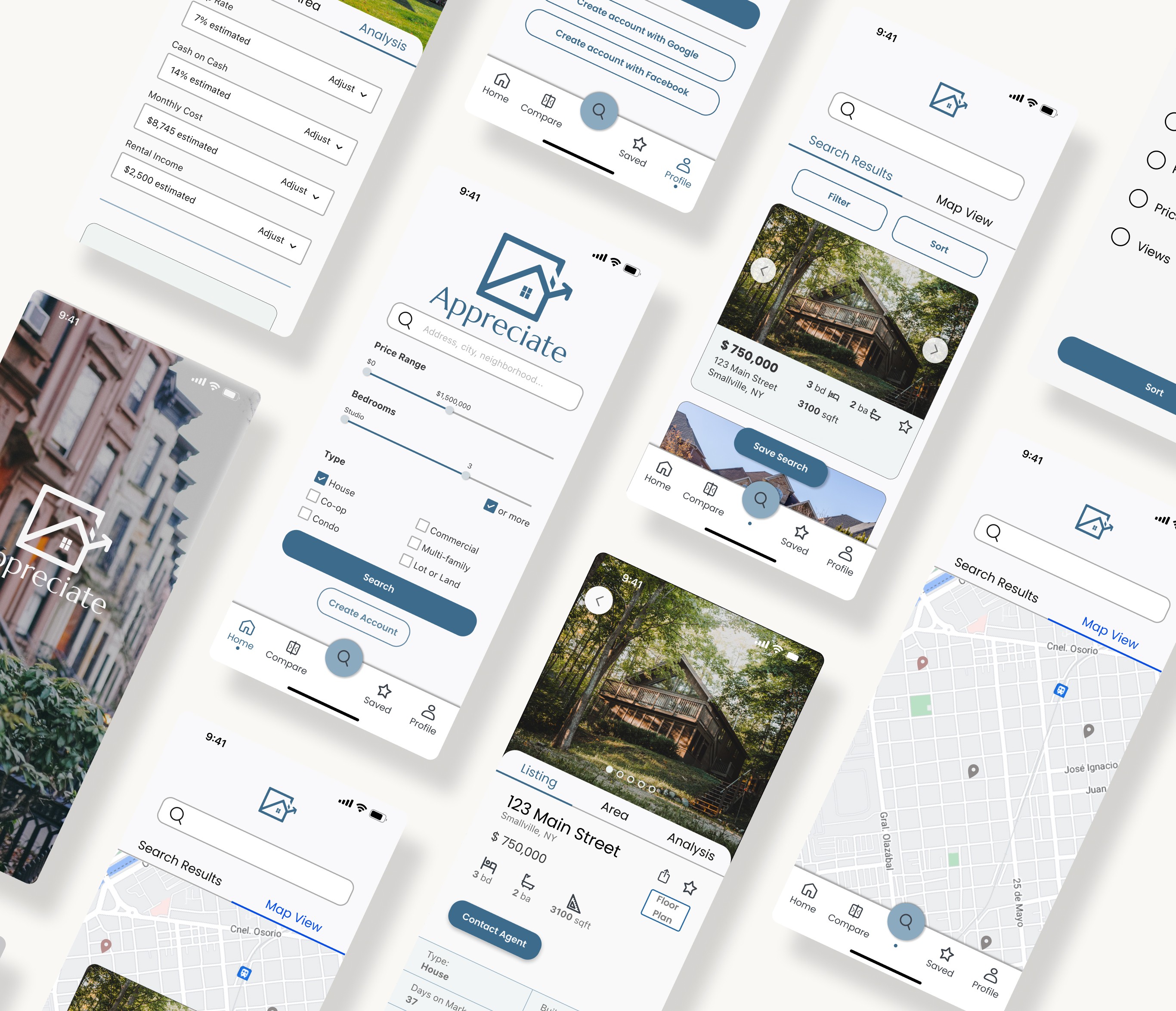
Real estate apps must juggle multiple photos with data-heavy content.
Users should be able to sort results easily, find info on each page intuitively, and get a visual feel for the property.
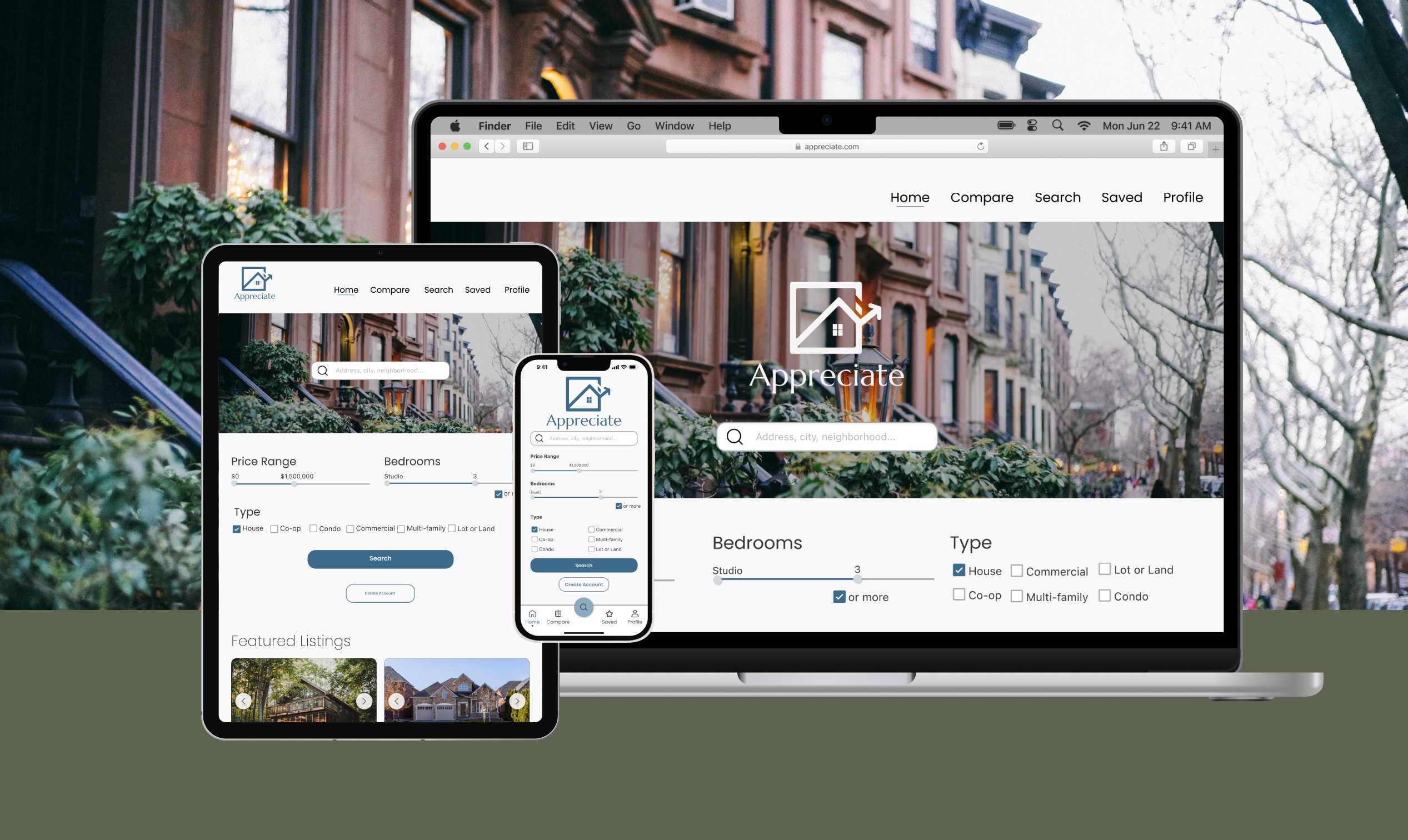
Appreciate is an iOS app and a responsive web app designed to empower new real estate investors.
On top of its easy to search database, it provides calculators that help you evaluate properties using the same metrics the pros use, and helps plan exit strategies down the line.
Research
Key Takeaways
A few calculations are helpful when evaluating and comparing properties. Making those calculations easier would provide real value to users.
A real estate investor needs to keep in mind different exit strategies. You could buy and hold a property, flip it, or use something called the BRRRR Method (Buy, Rehab, Rent, Refinance, Repeat).
“I’d love an easy-to-use calculator that pulls in the relevant details for the cap rate, or where I can plug in some baseline details once and have it populate each time I want to calculate something like the cash-on-cash return.”
“Having an app that would allow you to compare multiple exit strategies for a building would be helpful.”
Competitor Analysis: Showed a gap in the market for these exit strategy calculators
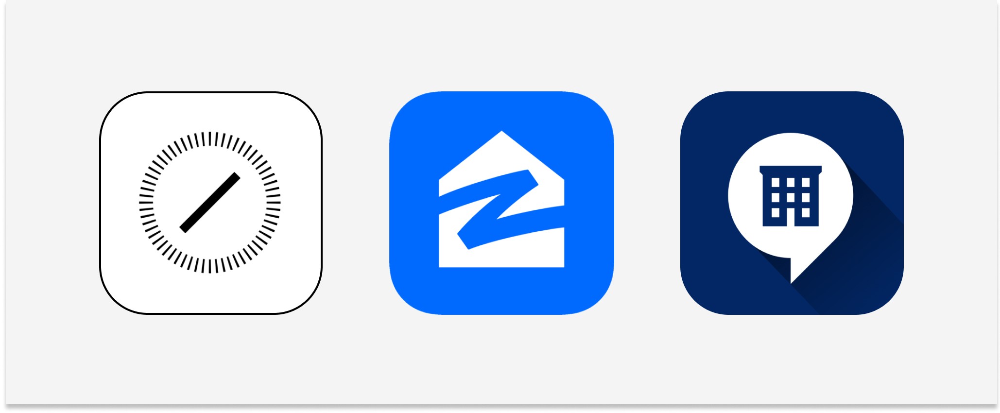
I looked at Compass, Zillow, and Streeteasy.
Key Takeaways
They are great at presenting a large amount of information in a digestible, organized way.
While each had a way to calculate monthly payments, none of the products provided an easy way to run the other common calculations or plan exit strategies as requested in the user interviews.
Designing
User Flows: Helped map out the user stories that were provided
“As a user, I want to create a profile containing all my property criteria, so that I am recommended results most relevant to me.”
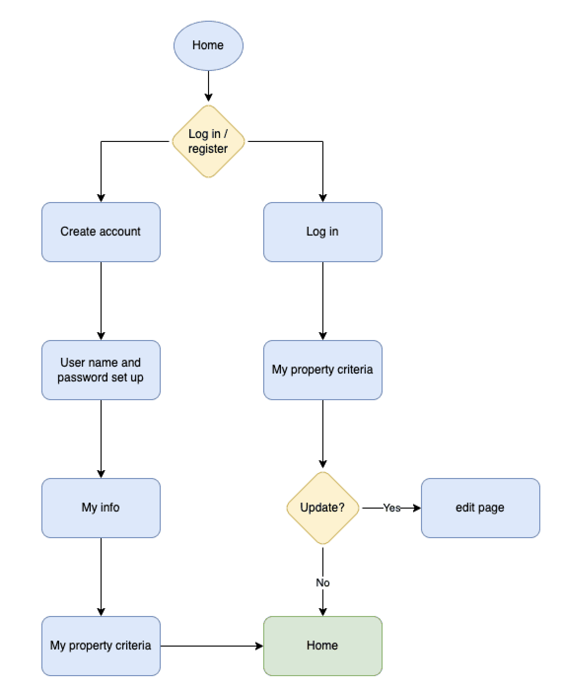
“As a user, I want access to as much written and visual information as possible about properties I’m interested in, so that I can make an informed decision.”
Pen and Paper Sketches: Some navigation ideas changed but tabs on listing pages stayed

Iteration:
My original concept used a hamburger menu.
As I developed the information architecture, it became clear that there would be only a few menu sections. A bottom menu bar would work better.

Tabs at the top of the listing page allows the user to switch between information grouped into categories.
Mid-Fidelity Wireframes: A focus on spacing helped establish the UI of the final design

Mood Board: Two options were created – impersonal floorplans vs warmer interiors and we went with the warmer option
The focus is on warm images, earthy colors, and mix of modern and timeless interior design to create an inviting and comforting tone.
A blue accent color scheme was chosen to heighten the sense of calm professionalism.
The app’s focus on providing insightful calculators and neighborhood data could easily result in a cold, data-heavy look, but a warm and inviting tone can help balance that out nicely.

Animation: A double meaning provided a little delight
The loading animation shows the logo with a line being drawn to complete it.
The line evokes a roofline as well as a graph of appreciating property value.
Style Guide
Responsive Design
Home Screen

Search
