New York Art Calendar
End-to-end design for a website listing NYC museum exhibits
Timeline
6 months
My Role
Freelance Product Designer and Framer Developer
Tasks
New York art lovers need a way to keep track of multiple exhibits from different museums and galleries because most websites focus on the art and not the date ranges. It can be tough for users to keep track of timelines from shows across all the various galleries and museums.
Limited budget for software engineering.
The core Gantt chart feature requires a custom coded solution, so the challenge was creating a MVP that provided similar value as the eventual final product.
I worked directly with the site’s founder
We communicated primarily through email exchanges but also in occasional one-on-one meetings for more in-depth brainstorming and feedback
Research
Competitor Analysis: Revealed that there was a gap in the market for a site that focused on exhibit opening and closing dates
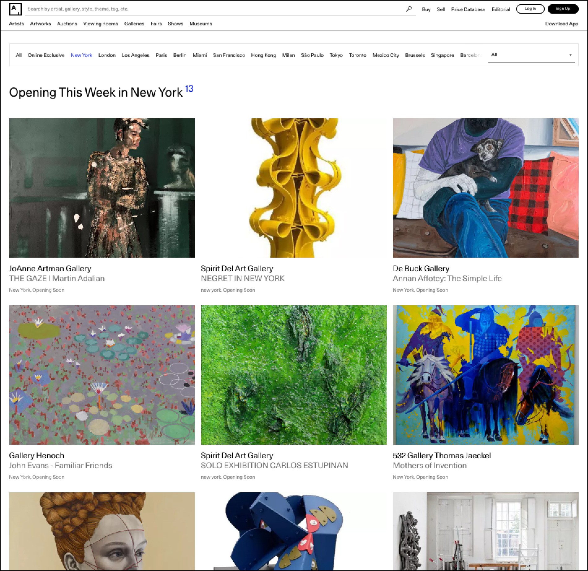
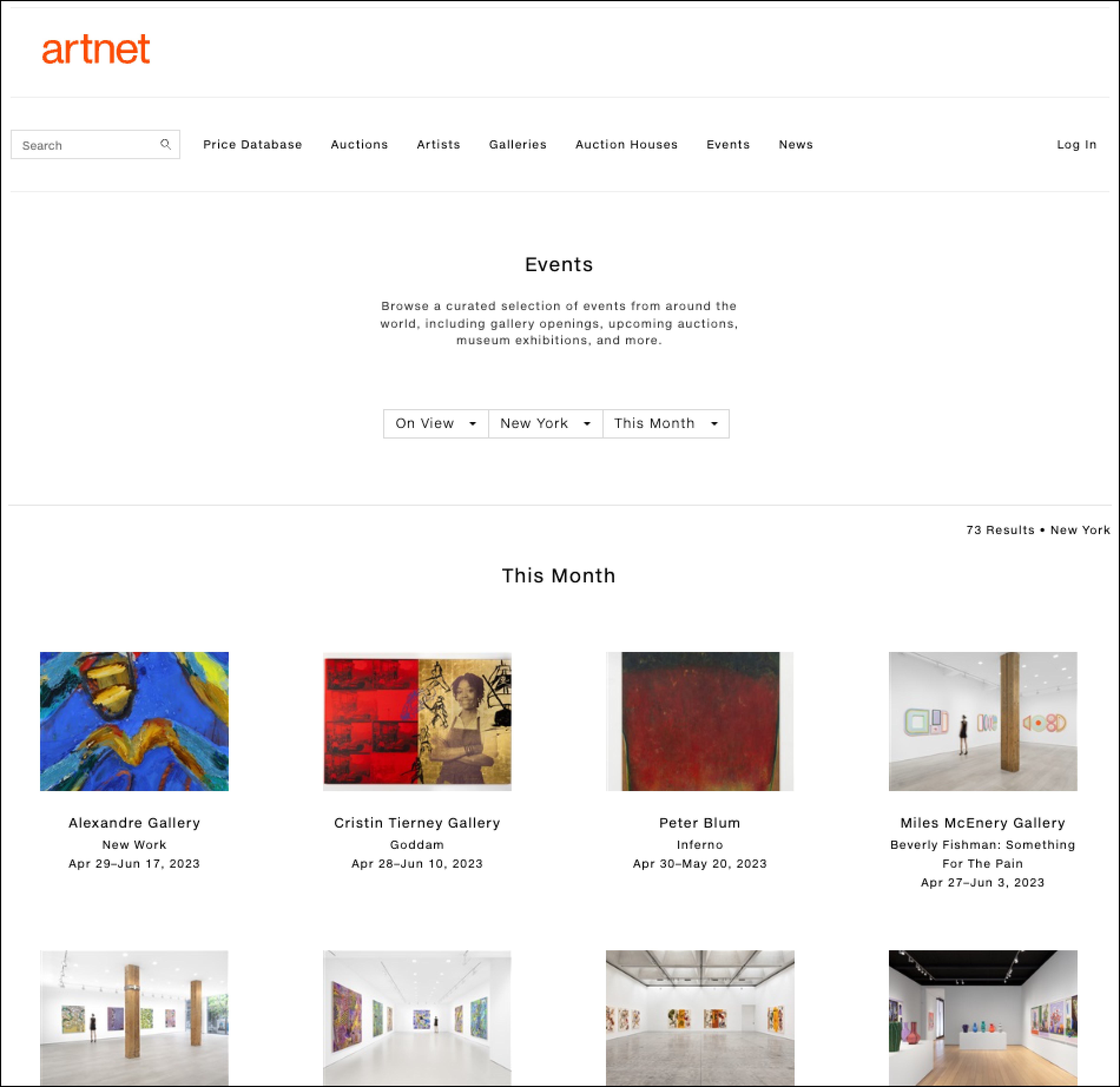
Artsy.net and Artnet.com
Key takeaways:
The focus is on a big grid of events.
The main benefit is providing a single place to look at events from multiple museums and galleries.
But there’s no easy way to see what’s brand new, or what’s right about to close.
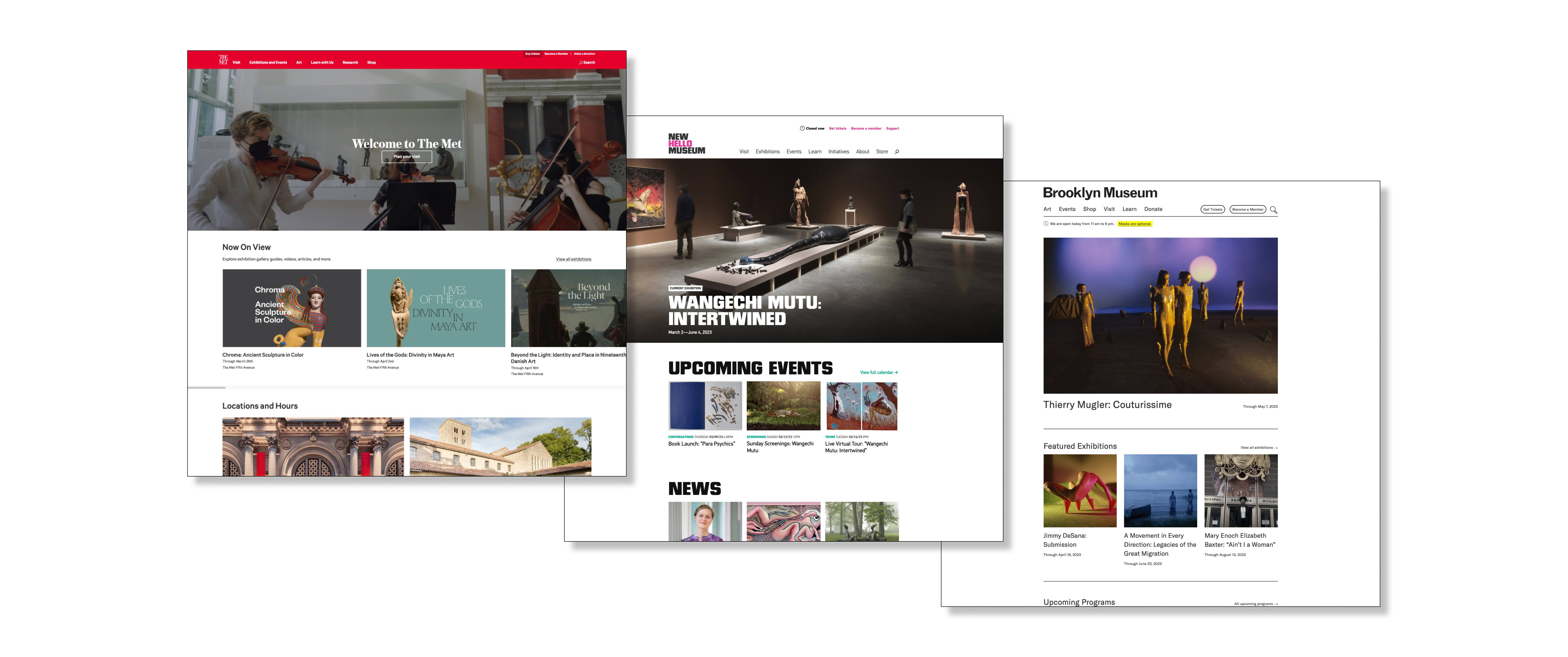
I also looked at museum and gallery websites. The New York Art Calendar should be in visual conversation with those sites.
The Proposed Solution: Gantt charts for exhibits
An elegant website that displays art exhibit timelines in a Gantt chart format.
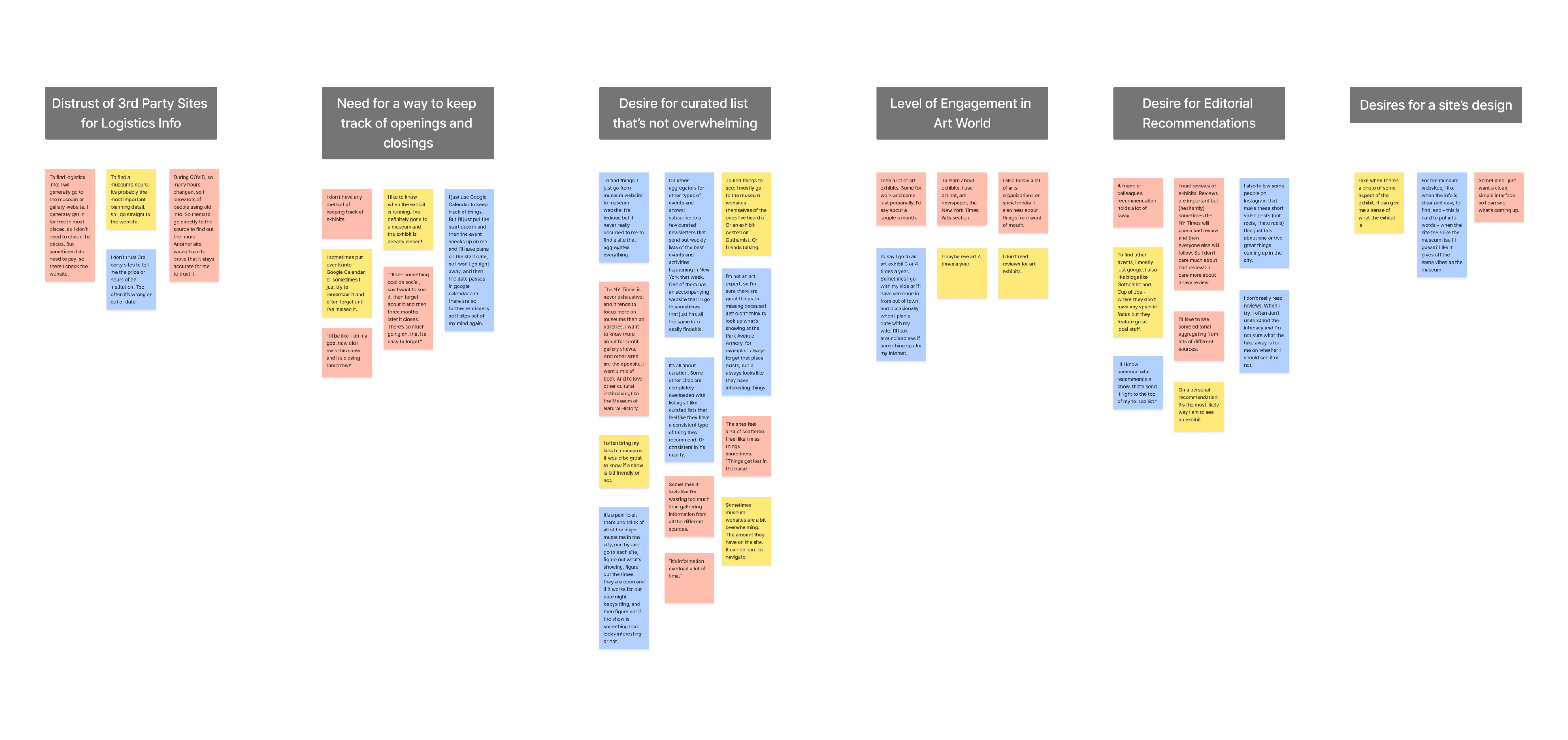
Interviews & Affinity Mapping: Began to validate the Gantt solution
Key takeaways:
Staff picks and curation will be key.
Get rid of museum hours. Users distrust 3rd party sites for that info.
Users need a way to keep track of opening and closing dates of exhibits.
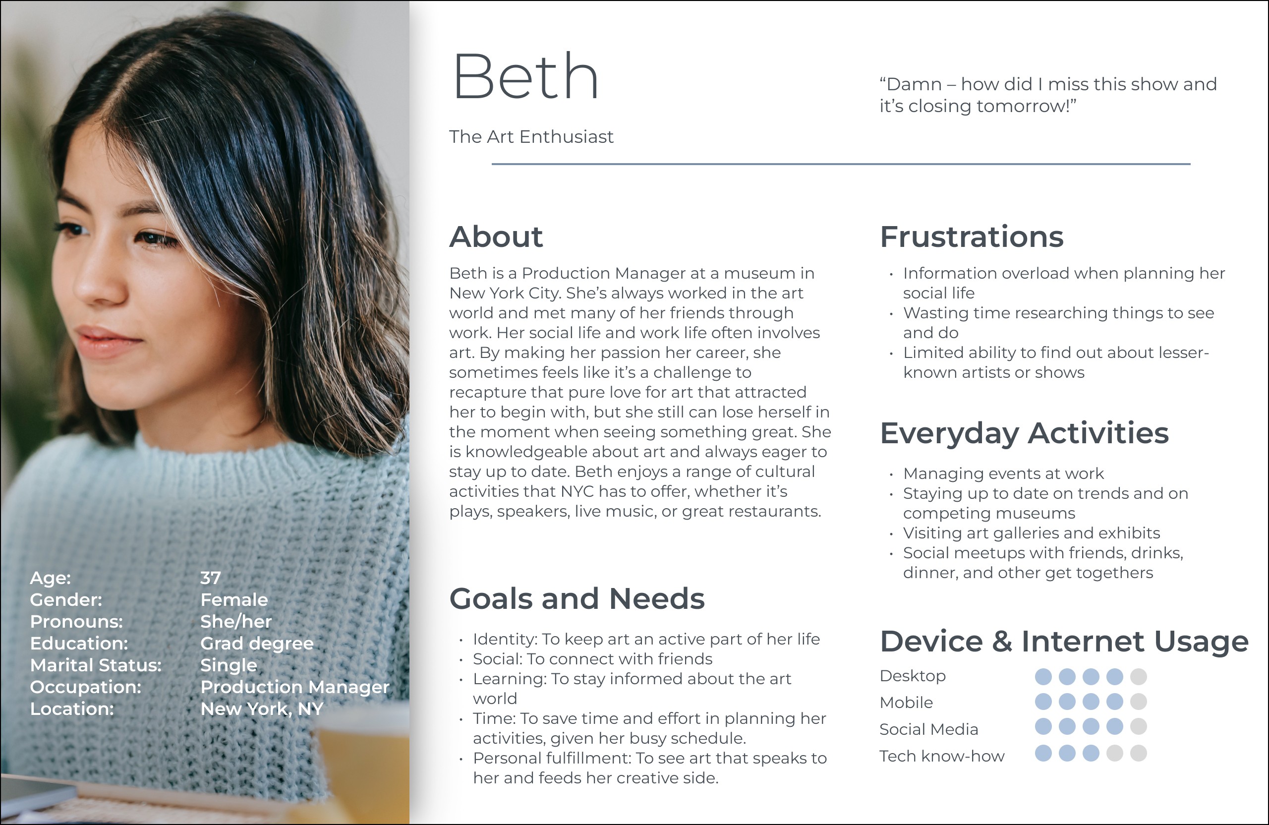
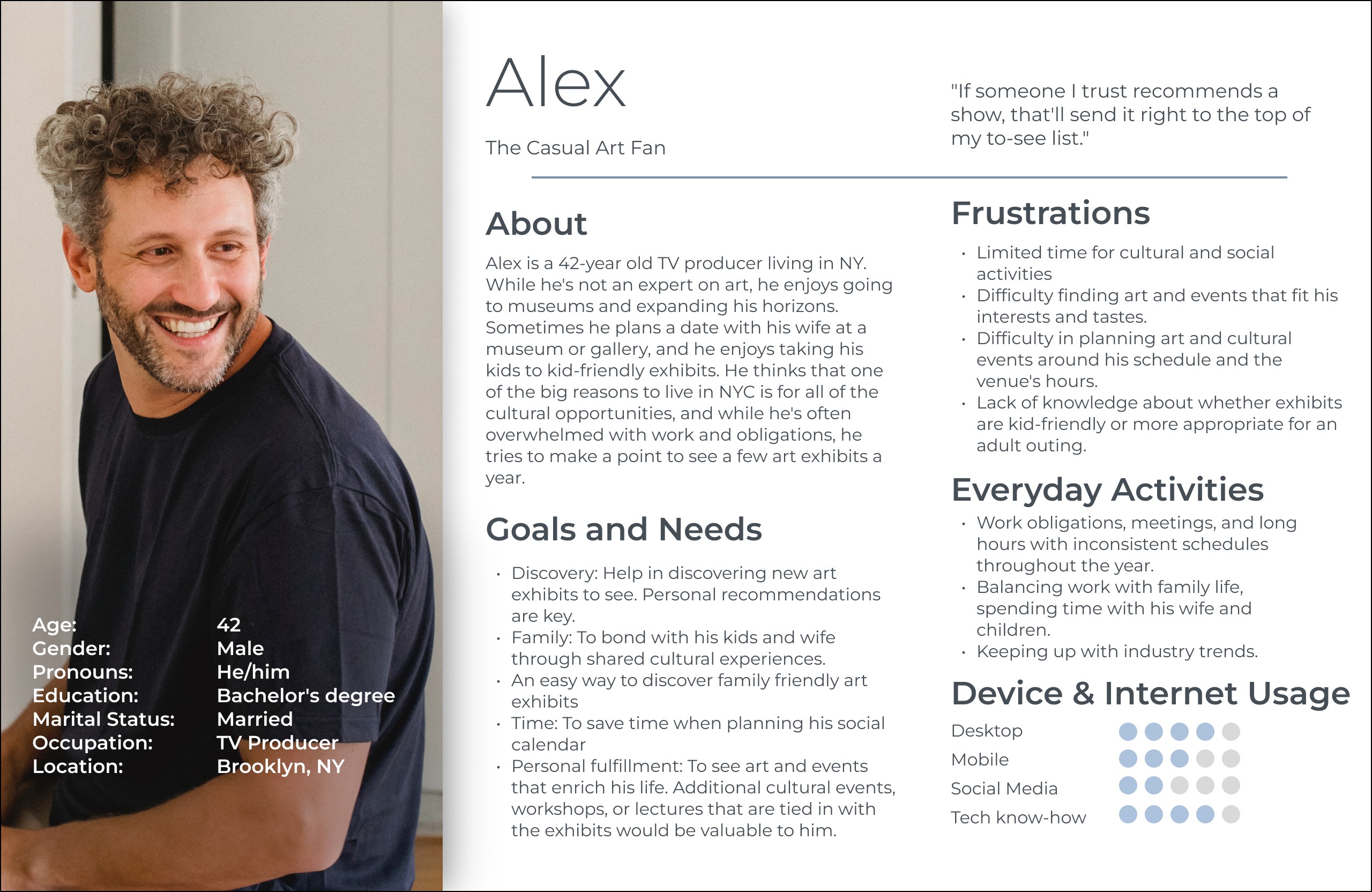
Personas: Clarified the needs of casual art fans and art enthusiasts
Key takeaways:
Staff picks and editorial content are key to engaging both art enthusiasts and casual art fans.
We must present opening and closing dates in an easy-to-follow format.
User Stories: Helped isolate the needs of both personas and see where solutions overlap
As a casual art fan, I want to keep track of openings and closings, so that I don’t lose track of exhibits I want to see.
As an art enthusiast, I want to keep track of openings and closings, so that I can manage the full list of exhibits I’m interested in seeing.
As a casual art fan, I want to see staff picks, so that I can start to trust the site’s recommendations as if they were a friend’s advice.
As an art enthusiast, I want to see staff picks, so that I can feel as though I’m in communication with a knowledgeable person in the field.
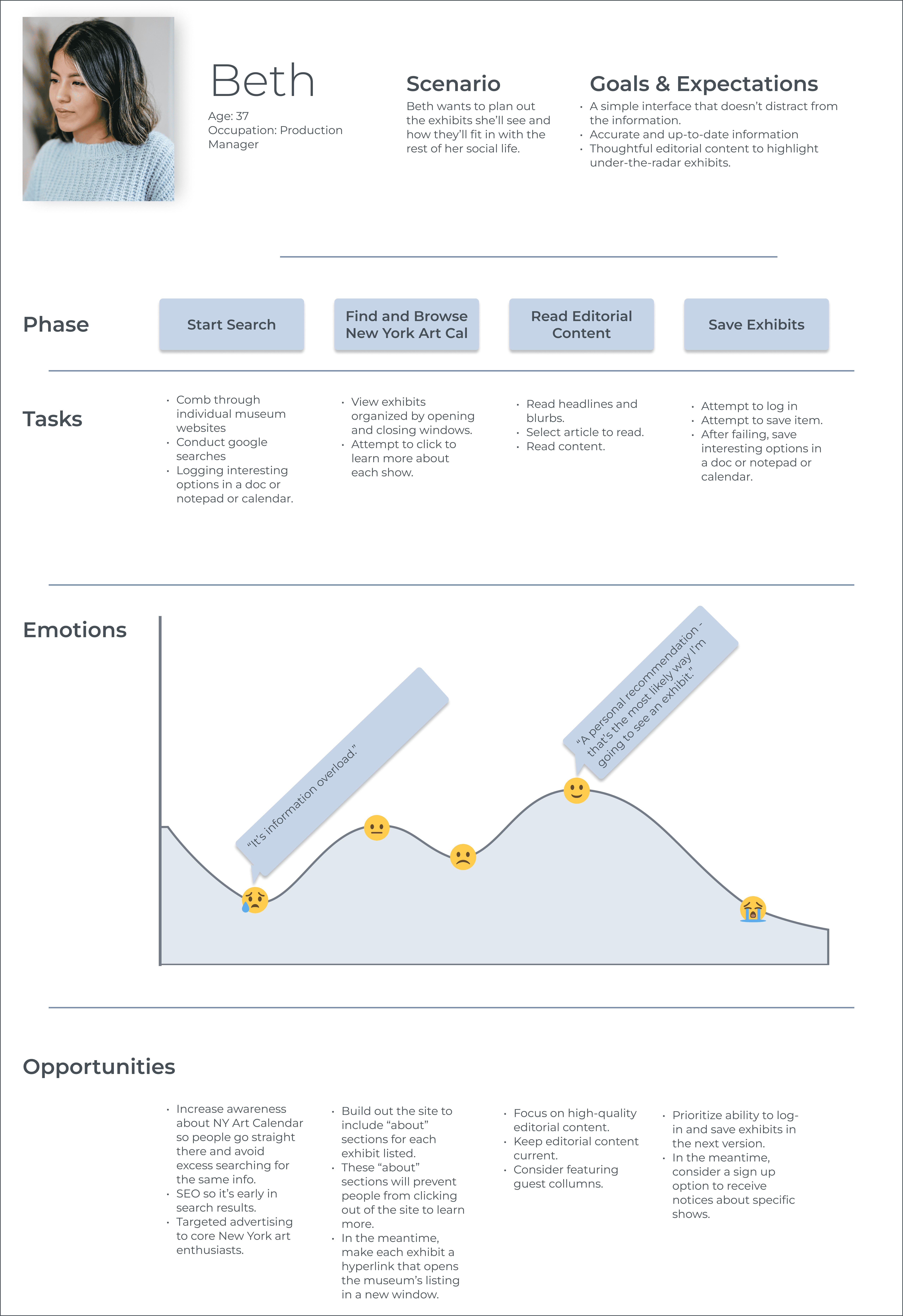
User Journey Map: Helped avoid creating new pain points on the site
Key takeaway:
Ensure that each exhibit links to the museum’s listing, so users avoid the aggravation of having to search for an exhibit separately.
Designing
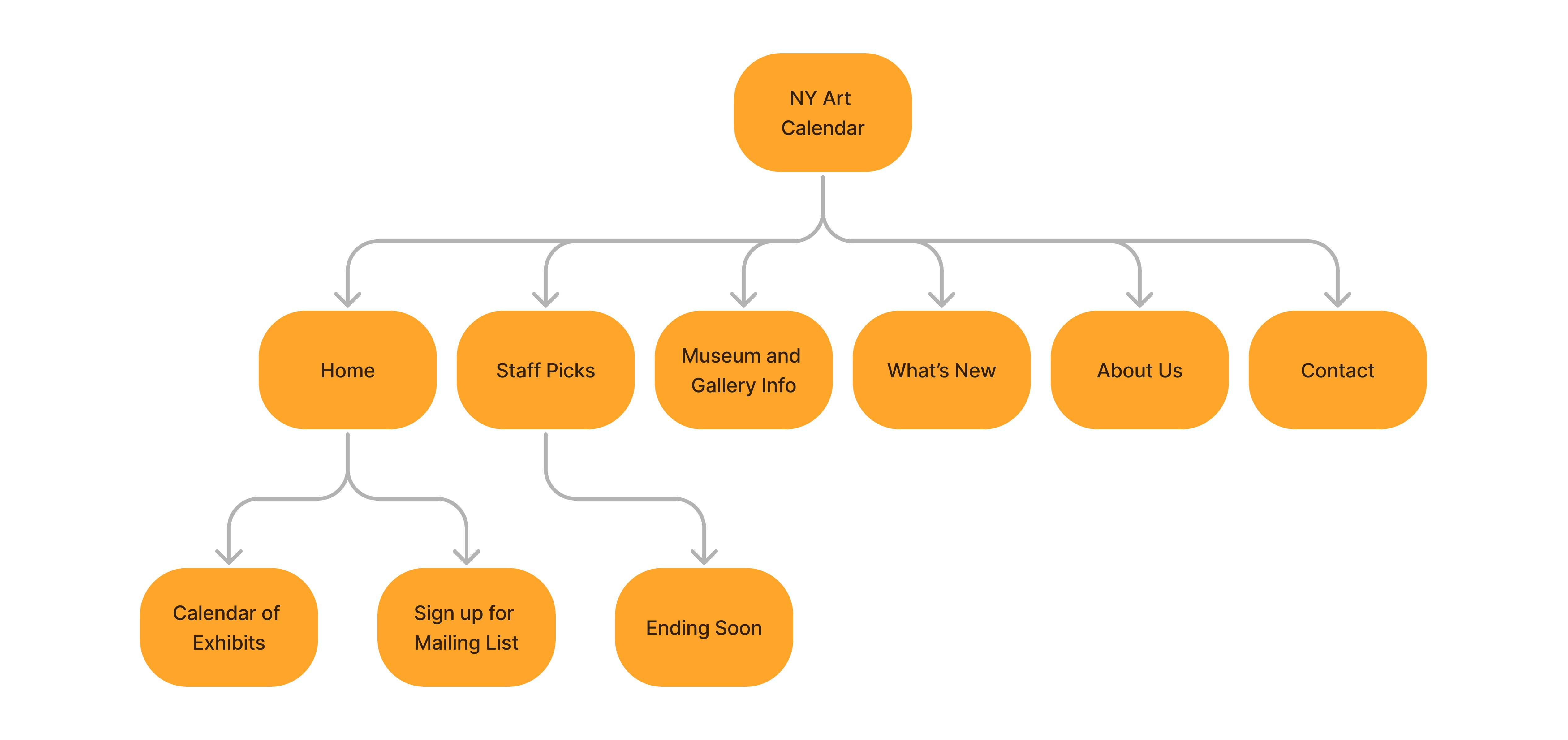
Sitemap: Started more ambitious but was simplified for the MVP
This sitemap ended up being simplified further to just:
Home
Staff Picks
Sign Up
About
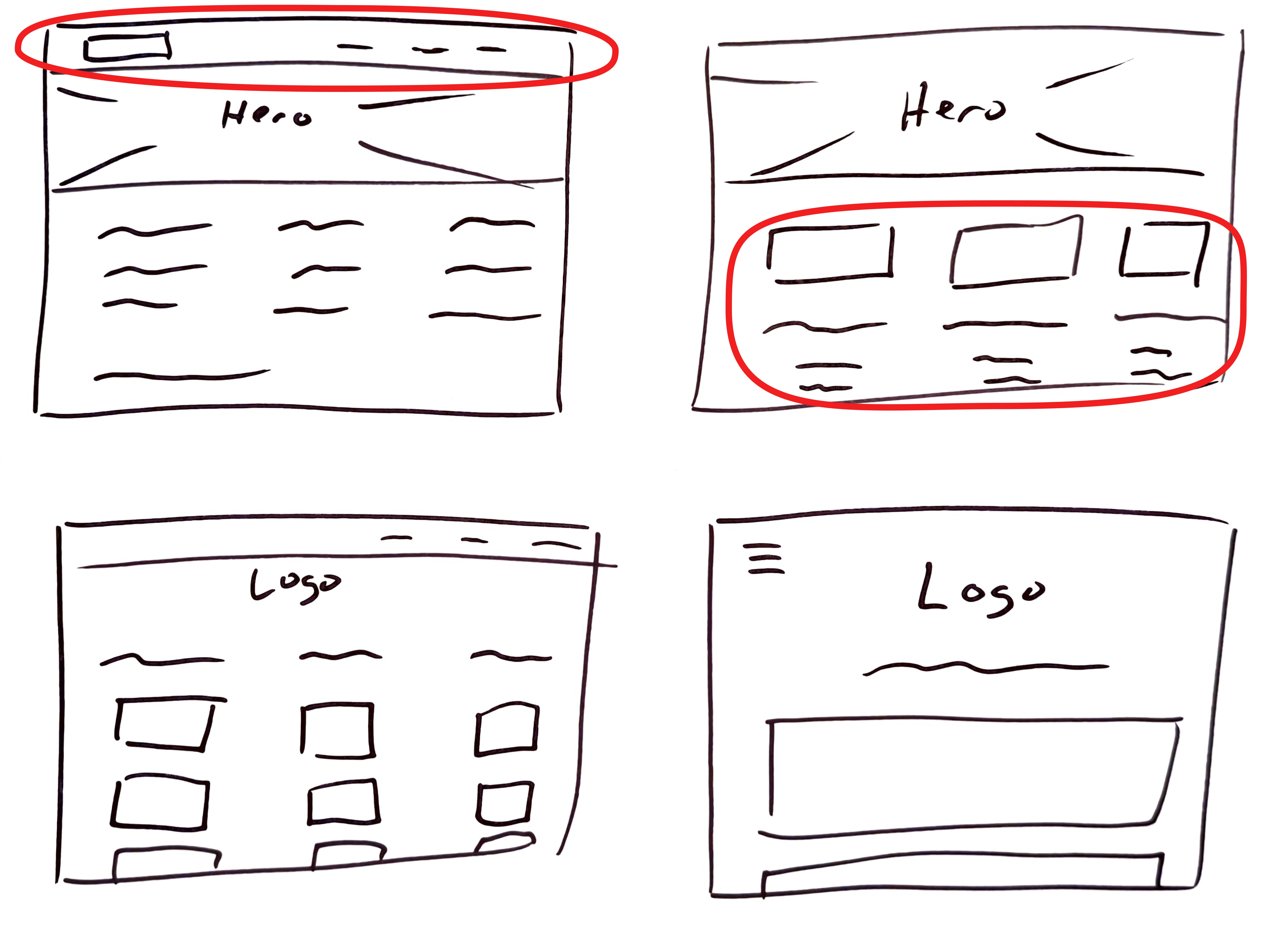
Crazy Eights: Generated layout ideas fast
I did a round of Crazy 8s to generate some ideas fast.
I ended up going with a blend of the top left two options here. The navigation from the first one, with the three column format that is topped with large images from the second.
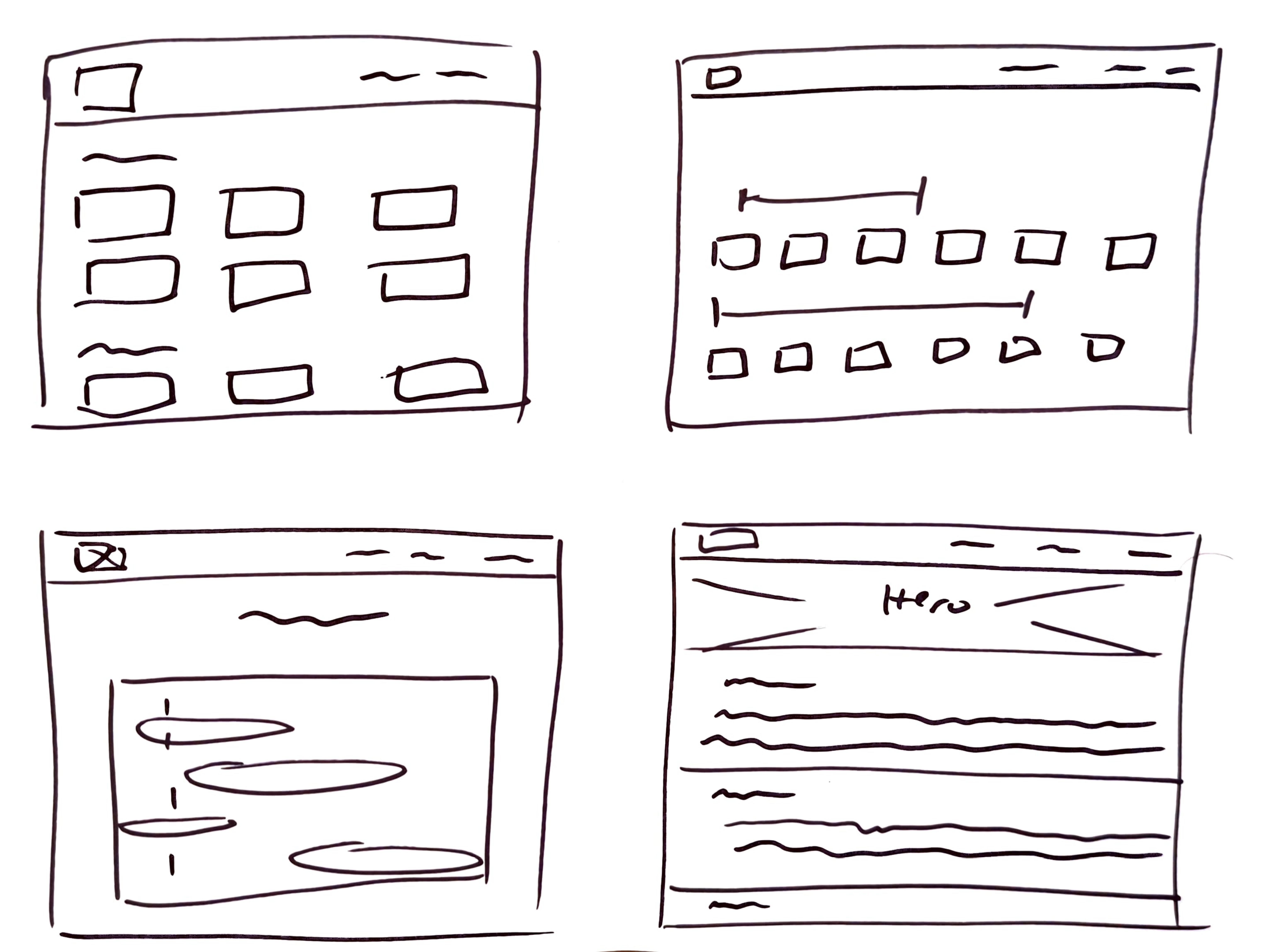
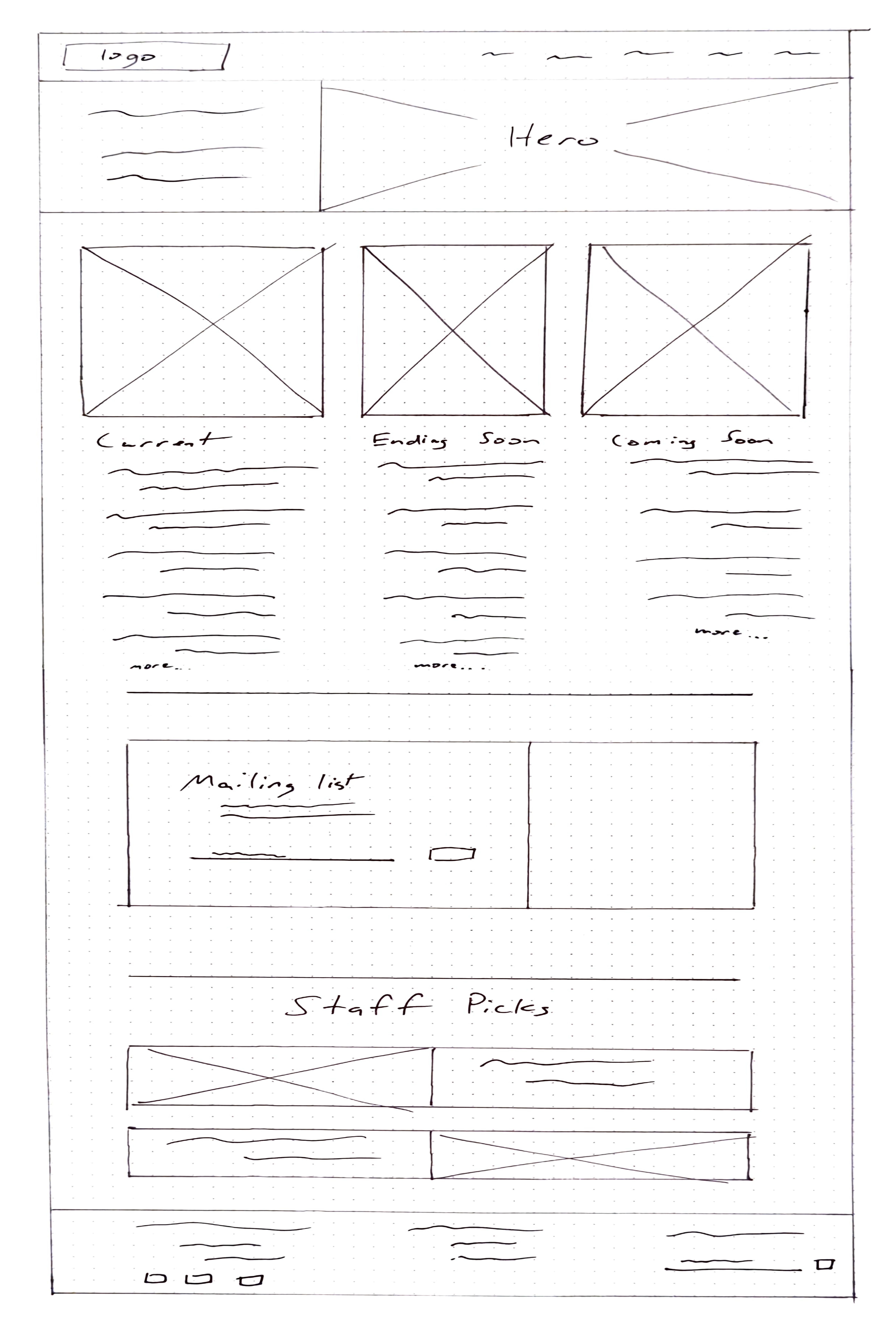
Pen and Paper Sketches: Brought the design ideas together
A simple list of exhibits may be functional, but won’t have people returning to the site or sharing it with others.
Without the more advanced Gantt chart view in the MVP, we looked at the user interviews and drilled down to the core function of a Gantt view: to quickly and easily see what’s ongoing, what’s new, and what’s about to close.
Other features:
Rotating hero image of interesting art from the public domain
Large feature photos at the top of each column
Staff picks and editorial content
Clean design inspired by museum websites
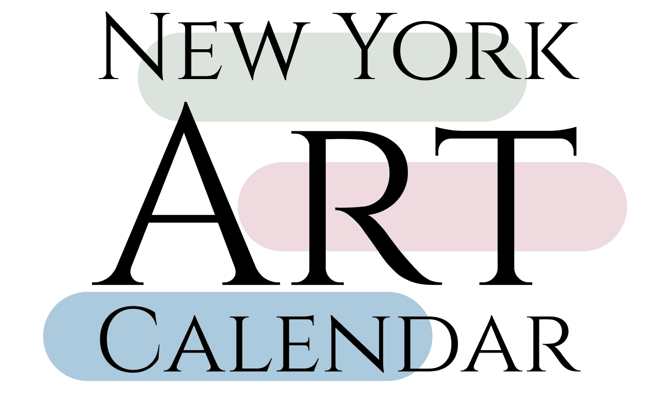
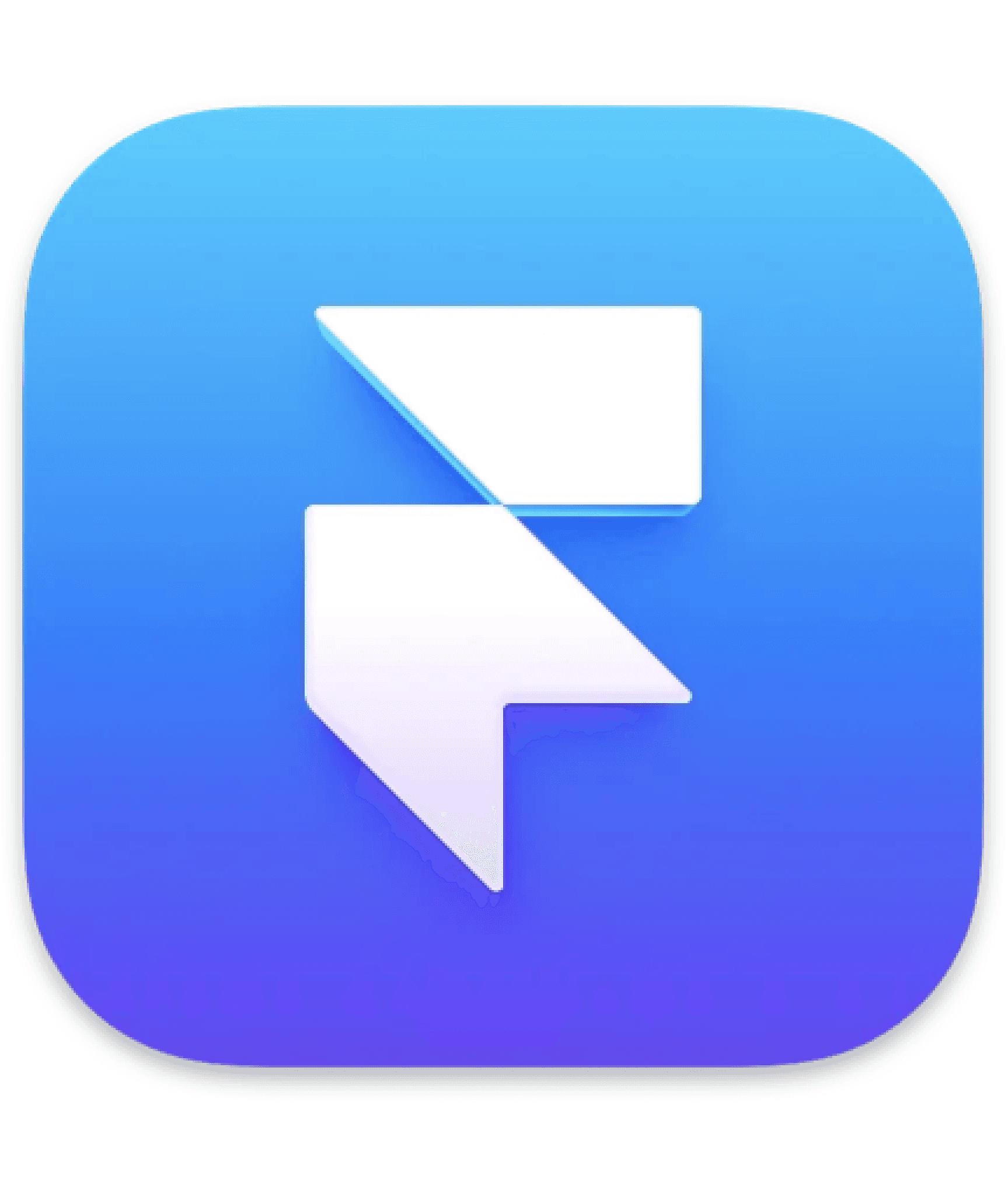
Logo: Was inspired by both Bauhaus and Gantt chart bubbles
The idea is for a simple logo that might make some people think it’s conjuring a Bauhaus style design with the colorful rounded shapes in the background, but really, it’s to hint at the Gantt chart bubbles that will eventually be incorporated in the site.
Framer MVP
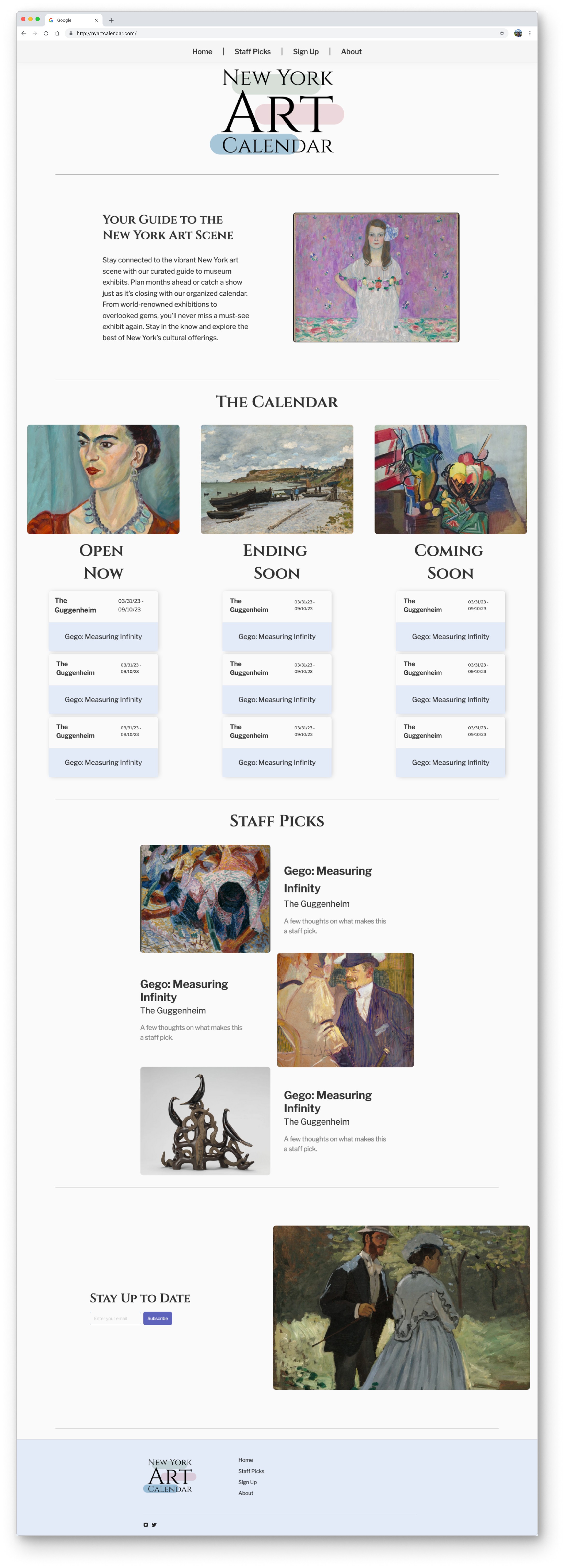
Roadmap to a final product
We’ll replace the 3-column layout with the Gantt view.